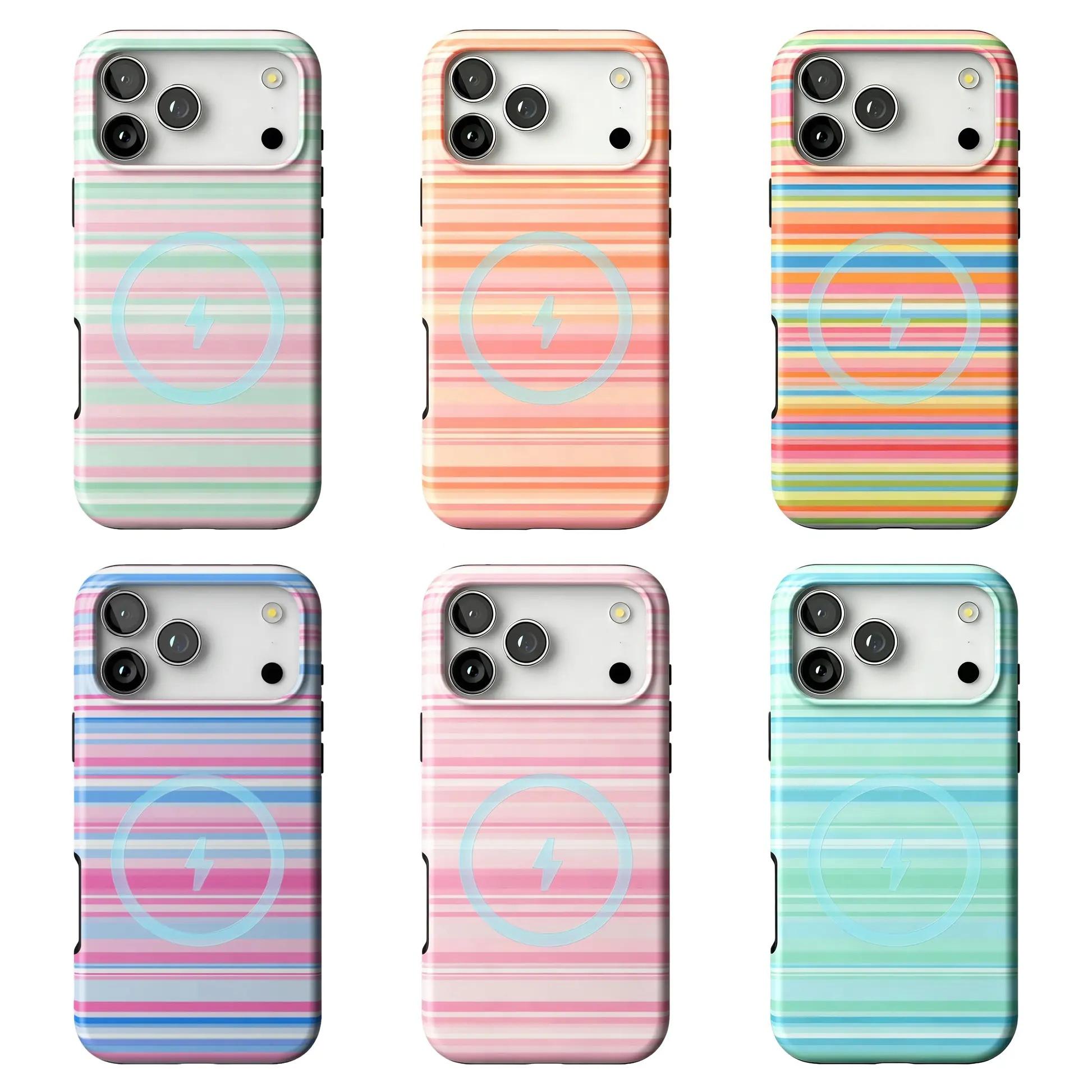
Do not build a scene for the phone. Start with three places where it already comes to rest. Photograph the same case back from roughly the same distance in each place, without adding a cup, book, flowers or an outfit. When the object stays fixed and the surface changes, the useful question becomes precise: do the horizontal bands, the pale circle or the edge against the surrounding ground read first?
Keep one case, its back-facing orientation and the framing roughly steady. Change the surface beneath it, then compare only the visible contrast and boundary relationships.
01 — Use places that already exist
Choose three ordinary places where your phone already comes to rest. Add no props and build no scene. The comparison begins with places that belong to your day already, so the exercise stays focused on the relationship between case and surface.
02 — Keep the object and viewpoint steady
Use the same case with its back facing the camera. Keep the distance and direction roughly steady under reasonably similar light, changing only the surface beneath it. This is a simple visual comparison rather than a scientific color test; if a location is not safe for the phone, skip it.
03 — Read the fixed pattern anchors
The catalog composite shows six backs built from one repeated arrangement. Horizontal bands fill each visible back, a pale circular graphic crosses the lower-middle area, and the camera area interrupts the upper-left corner. Choose one colorway for your comparison and keep those three anchors fixed.
04 — Compare the boundary, not a personality
For each photograph, write one sentence about the boundary: does the outer edge separate clearly or blend, do the stripe field or pale circle read first, and does a nearby line compete with the horizontal bands? These are local visual observations, not statements about personality, mood or taste.
05 — Let three images answer one small question
Place the three photographs together. Ask which relationship stays consistent and which changes with the ground. The result can show where the pattern becomes more or less visually prominent, but it does not identify a universal best setting.
Object note: The catalog composite is the fixed visual reference. Its six variants change visible band colors and contrast while retaining the same broad arrangement. The image does not establish exact color across screens or rooms, material, finish, fit, charging, magnetic performance, protection or durability.
Use the places the phone already rests; change the surface, not the story around it.